

See this visualization first on the Voronoi app.
Both U.S. Political Parties Have a History of Gerrymandering
This was originally posted on our Voronoi app. Download the app for free on iOS or Android and discover incredible data-driven charts from a variety of trusted sources.
- Both Republicans and Democrats have engaged in gerrymandering, earning “poor” partisan fairness scores in multiple states.
- The Princeton Gerrymandering Project uses simulations and expert analysis to grade states’ redistricting maps.
- States like Texas (Republican) and Illinois (Democrat) showcase extreme partisan advantages in their district boundaries.
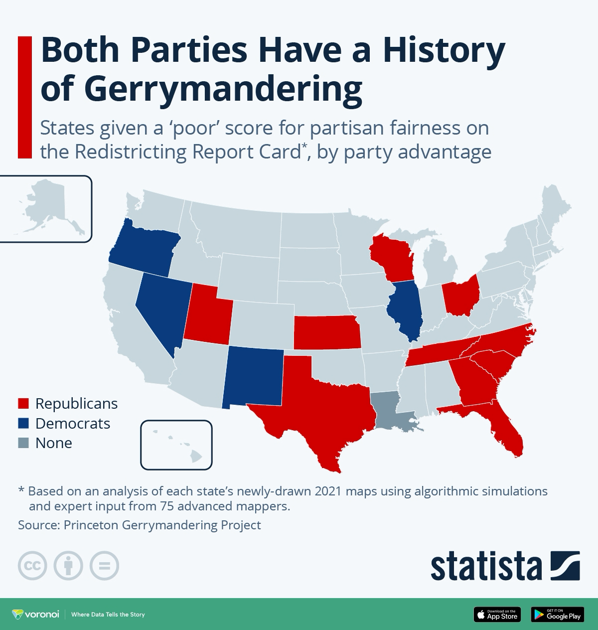
Gerrymandering, the practice of drawing political district lines to favor one party over another, has long been a controversial fixture of U.S. politics. While it’s often portrayed as the tactic of one political side, recent data shows that both Republicans and Democrats have been guilty of it. The result? A distorted democratic process where electoral outcomes may not accurately reflect the will of voters.
According to the Princeton Gerrymandering Project, visualized above by Statista, such manipulation of district boundaries undermines fair representation, contributing to why the U.S. is ranked as a “flawed democracy” globally.
Here are the states that received a D or F grade in the Princeton Gerrymandering Project’s Redistricting Report Card:
| State | Overall Score | Partisan Advantage |
|---|---|---|
| Florida | F | 🔴 Republicans |
| Georgia | F | 🔴 Republicans |
| Illinois | F | 🔵 Democrats |
| Kansas | F | 🔴 Republicans |
| Louisiana | F | None |
| Nevada | F | 🔵 Democrats |
| North Carolina | F | 🔴 Republicans |
| South Carolina | F | 🔴 Republicans |
| Texas | F | 🔴 Republicans |
| Utah | F | 🔴 Republicans |
| Wisconsin | F | 🔴 Republicans |
| New Mexico | D | 🔵 Democrats |
| Ohio | D | 🔴 Republicans |
| Oregon | D | 🔵 Democrats |
The data reveals that partisan gerrymandering isn’t a regional or partisan anomaly. States like Texas, Georgia, and Florida — controlled by Republicans — earned poor fairness grades. On the other side, Democratic-led states like Illinois, Maryland, and Oregon also failed the fairness test.
How the Redistricting Report Card Works
The Princeton Gerrymandering Project analyzes newly drawn district maps using algorithmic simulations and feedback from a panel of 75 redistricting experts. The maps are graded for partisan fairness, competitiveness, and geographic compactness.
A “poor” partisan fairness score suggests that one party has engineered the lines in a way that tilts the playing field, often locking in an advantage for years.
Egregious Examples from Both Parties
In Texas, Republican-controlled redistricting heavily altered the boundaries around Houston, the state’s largest urban area. By splitting Harris County into multiple districts that each extend far into rural, conservative areas, lawmakers effectively diluted the influence of the city’s predominantly Democratic voters — a tactic known as “cracking.”
Meanwhile in Illinois, Democrats used their control over the map-drawing process to reshape districts around Chicago. One striking example (which has since been redrawn) was the 4th Congressional District, often called the “earmuffs” district, which connected two distant Latino communities with a thin strip of land, while isolating Republican-leaning suburbs. This unusual configuration helped secure Democratic seats while minimizing Republican competitiveness in the region.
Why Gerrymandering Hurts Democracy
When electoral maps are drawn for political advantage, the result is often less responsive government. Safe seats encourage political extremism, reduce bipartisan compromise, and weaken the connection between constituents and their elected officials. Over time, this erodes trust in democratic institutions — a problem that public opinion surveys suggest many Americans already feel keenly.
Learn More on the Voronoi App 
Check out More Than Half Of America Thinks The Nation Needs A Third Major Political Party to see how public frustration with the two-party system is growing.

This article was published as a part of Visual Capitalist’s Creator Program, which features data-driven visuals from some of our favorite Creators around the world.